Monday, February 27, 2012

Entry 15 - Type Background 2

The second background that needed to be with my project was for the audience. This simply needed to be a floor on which they could stand. This was simple enough. First I simply typed out the word "Floor" multiple times until I had a wall of type:

"The Wall of Text"

After this, I had to use the 3D Revolve tool in Illustrator to put it at an angle, which ended up like this:

"The Wall is now a Floor"

With this floor shape, I now had something for the audience to stand on.

Entry 14 - Type Background

The process for making the areas the characters would be reacting on was a time consuming process. When it came down to it though, it ended up being easier than I originally thought it would be. The first thing I had to do was create a stage for "Show." This started with just finding a stage image:

"The Stage"

Once I had done this, I was able to take it into Illustrator and create Type that followed the general shape of the overall stage. I also used different colors to give the stage a sense of depth and character. This was the final product:


"The Stage of Type"

So far, this has turned out to be my favorite portion of the project so far, simply because of how well it turned out. It went better than expected. 

Wednesday, February 15, 2012

Entry 13 - Early Kinetic Type Storyboard

This was the storyboard I originally created for the project. While It does need to be revised for variable reasons, I felt it would still be a good idea to include it with my other works so far.

Monday, February 13, 2012

Entry 12 - Landscape Typography

Much like the portraits from my previous post, I was able to actually find landscapes made of type. Granted, what I will be doing will be both simpler and more complex, but I feel these are good examples of what I want to do when it comes time to make the overall landscape in my piece.
 
"Farm"

"Beach"
  
"The Church"

Of the 3, the Church is my favorite so far. the first 2 have this complex but childlike quality to them, but number 3 has this sense of professionalism to it. The piece was also done by way of a typewriter, so this seems more like an archival piece than anything else.

Entry 11 - Kinetic Typography Tutorial

Now that I'm reaching the point where the conceptualization period is almost over, it's time that I start focusing on the After Effect aspect of the project. With that being said, I've decided to include 3 videos in a short series that is actually a tutorial on Kintetic Type in After Effects.

These videos, in actuality, act more as something I can look at during the work period, so by storing them here, I can have quick and easy access to them.


Entry 10 - Type Portraits

During my research period for my Kinetic Type video, I found what I've decided to call "Type Portraits." More or less, they're portraits where the people are simply made out of type. I found them impressive, and I was also able to get some notes and concepts just from looking at them.

Feel free to enjoy them:

"House"

"Untitled"

"Jimi Hendrix"
 Now, while I won't be doing anything as complicated in my actual video, the thing I can gather from these portraits is that different sizes of type can actually simulate shadows and textures. This will actually come in handy when it comes time to design the actual backgrounds that my characters will be on.

Sunday, February 12, 2012

Entry 9 - Kinetic Type Research 3

When it comes to professional Kinetic Typen commercials, there were far and few in between when it came to finding them. However, I was able to track down two that I liked. I've included them below:


The only real lesson I could gather from watching these two videos was that, above all else, the video must be smooth. Since we will be using After Effects to do the program, It would be wise to monitor the movement present in the video when it comes time to make it.

Entry 8 - Character Design 3

In concerns to the "Dude," and the "Women," I realize I didn't explain fully how they would be incorporated in the video. In my head, I saw them as being involved like this:

"The Audience"
 By doing the audience this way, it saves me the trouble of having to make individual models for each background character. By simply changing the colors of their most defining feature, I end up creating different characters. In the long rum, this is the most practical choice.

Entry 7 - Character Design 2

Once I was done designing both the "Show" and the "Boss," I felt it was time to design the characters that would be in the audience of my video. Realistically, designing indivual characters to put in the audience would end up taking too much time. So, I decided to just make 2 figures, a male and a female:

"The Dude and the Women"

I foubnd that making them, much like the "Boss," was alot easier since I had learned from making the "Show." The "Dude" was made up of the Copperplate font, which made him as skinny as the "Show," if not more so. So far, I don't want to say he's my least favorite character, but he's probably the least interesting of the designs I've done so far.

The "Women," on the other hand, has gotten an interesting amount of attention. She was made up of the Handwriting Dakota font, and that seemed to give her a different aesthetic than the other characters. From what people have told me, this made her look much more lively than her fellow designs, and the general consensus is that she's the best character in the bunch.

Though, my favorite is still the "Show."

Entry 6 - Kinetic Type Research 2

I figured it would be a good idea to include some more examples of Kinetic type, because I was able to find some more videos that showed more things that I could do:


By watching these videos, I was able to gather more notes to use for my project:
  • The color of the background can change, as well as the color of the type.
  • Keep in mind that the speed of certain movements can affect the videos readability.
  • Font is key. If the font is not a good type of font, it can detract from the video as much as color can.
  • Refrain from doing the same movements over and over again. It makes the video boring.
These videos were good examples of kinetic type, but they also illustrated some things that it would be best to avoid. I'll have to keep these things in mind when it comes to make my video in After Effects.

Entry 5 - Evolution of a character

In my previous post, you may have seen that I introduced my first 2 characters, the "Show" and the "Boss." Since I mentioned that "Show" took the most time in his conception, I feel that including the process of making him would make for a good post.

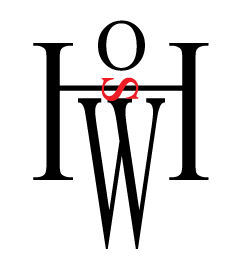
1.) The First Try
"Show Design 1"

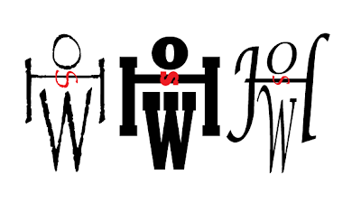
My first attempt worked better than I expected. I was able to take the word and was able to rearrange it and distort it so that it had a somewhat human shape. This showed that my idea could be implemented. However, suggestions were made in order to make him better. Namely, to try and experiment with different fonts for the character. I tried this and got multiple and varying results.
"Show Variations"

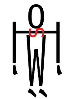
Eventually though, I was able to find a font that was able to work for the character.
"Final Show Design"

I found that a Sans Serif Font made the character look less complicated. It also made him look much thinner. I also found that by adding the quotation marks to the character, I was able to make makeshift hands and feet. 

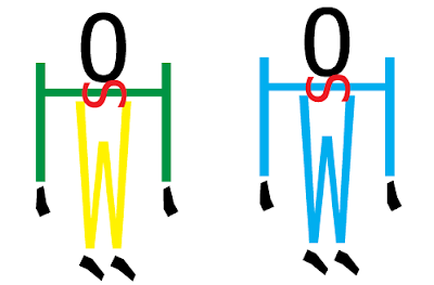
It was at this point that I tried adding more color to the character. However, this took away more than it added.
"Color Concept"
This idea failed miserably. The colors ended up making the character an eye sore. After experimenting with the character more, and with some suggestions from varrying parties, the character became this:

"Final Character Design"
By turning the character Gray, he ended up becoming more subdued. Also, by making the background a lighter gray, I was able to make it where he wasn't seperated from the background as much. He wasn't distracting, but he was where he would be able to keep the audiences attention.

It was at this point making the other characters became simple, because I took what I learned from the Characters conception and used that knowledge in making the other figures.

Tuesday, February 7, 2012

Entry 4 - Character Design 1


Once I had the general idea of what I wanted to do, I decided to start doing some character design for the video. As of the writing of this post, these are the two characters that I have so far:


"The Performer and his Boss"
 
Of the two, 'Show" went through a few changes in his creation. I went through a good amount of different types in designing him, since he's made up of type. Serif fonts didn't really make him look right to me, so I finally settled for using the Menlo font for his character.

The "Boss" character took less time to make. With the overall lettering, he just came out as a sort of short, pudgy individual. In a way, it kind of suits his character. I also found that by making him with a different font, he ended up with a different look and style in comparison to "Show." I figure I can do that with the background characters. There are all sorts of different people in the world, and the font changes show that.


Entry 3 - Kinetic Type Plot Synopsis

Since our overall project needs to be 15 - 30 seconds, I've been able to figure out the overall story flow for my video:
  • (0:00 - 0:02)  Fade in. Curtains made of the word "Curtain" open. Applause.
  • (0:02 - 0:05) Character on stage waves. He raises hands for silence.
  • (0:05 - 0:10) Character plays guitar for a bit.
  • (0:10 - 0:15) Boss spills water on speaker. Guitar shorts out.
  • (0:15 - 0:20) Character gets nervous as crowd whispers.
  • (0:20 - 0:25) Character shakes it off and finishes acoustically.
  • (0:25 - 0:30) Crowd cheers and short ends.  
Granted, the overall story may change depending on any suggestions that I get during class, but this is the layout I've been able to figure out so far. This will what I'll use for my storyboard for the time being. At an estimate, I should have 2-3 pages of storyboards for this project.

Thursday, February 2, 2012

Entry 2 - Kinetic Type Research

When it comes to research, the most useful tool that I have at my disposal always seems to end up being Youtube. With that in mind, I decided to start there, and I got a surplus of video examples of Kinetic Typography in practice:


From what I've seen, here are my observations:
  • Videos, more often than not, have a simple background. Anything flashy would be distracting.
  • Type can vary, but not too much.
  • Colors can affect the overall tone of a given video. Keep that in mind for background color.
  • With audio, words and movement should match with sounds. Ex. Lould equals larger letters.
  • 3D movement can be implemented. It makes for interesting ideas.

Of the 3 videos I provided, the 2nd and 3rd were the more interesting, and they provided some ideas for my overall video project. I intend to implement some of the effects and ideas that they used.